Highlights from the Faculty show
This past Friday our graphics faculty art exhibition was held on east campus. We were thrilled to see such a great turn out. If you missed the show let me share with you some of the highlights.
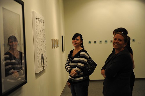
It’s always inspiring to have your work on display, even more so in a gallery. This was the first gallery exhibit I’ve participated in in about four years so it was fun to enter the gallery and see so many enjoying our work. Here’s Katie, Meg, and Wendy who were among the first to see some of the work in the gallery.
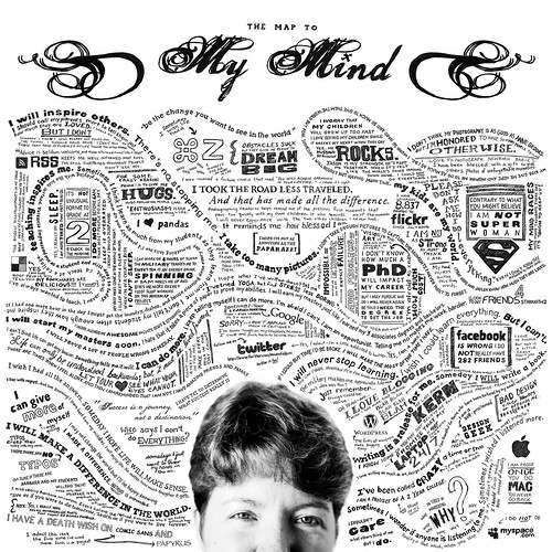
Yep, they’re checking out my crazy mindmap project.
I have to admit it was one of the many questions I had the night of the exhibit. “How did you do that?” Well, if you’re interested, I’ve shared my entire process on my personal blog as I explained my approach to “The map to mind mind” project.
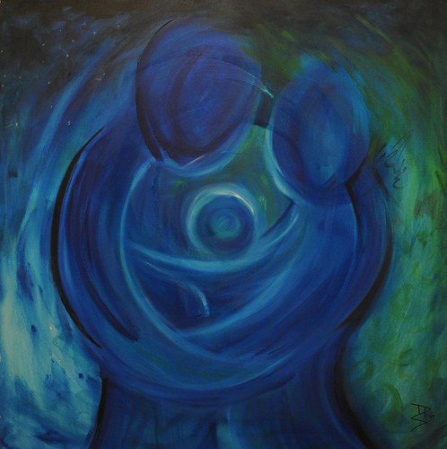
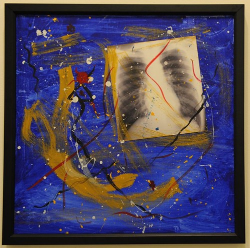
One of the challenges we all had with this faculty exhibit was that we were held to the constraints that it had to have been a self portrait, even if it was metaphorical, and it had to be a square. Dennis Santspree’s painting, “Ensemble” was definitely one of my favorites.
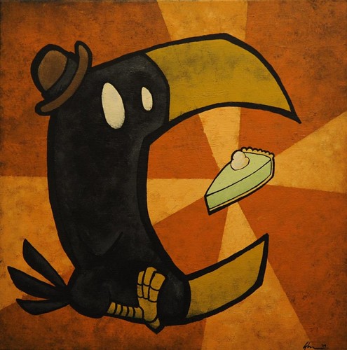
Shaun Wightman’s painting “Eating Crow” was a fun illustrative addition to the faculty show.
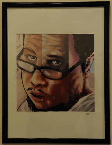
I really enjoyed the unique digital illustration style of Rafael Velazquez’s self portrait.
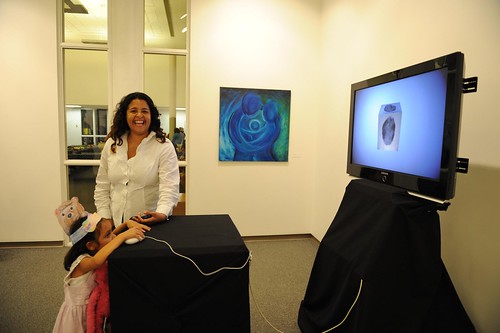
My daughter made it a point during the show to tell me that her favorite project in the show was Raul Valery’s self portrait. And no, Raul, I’m not offended one bit that she claimed it to be her favorite over her mother’s work, I definitely admire it equally as much as my daughter. 😉
Kristy took a super cool approach to the concept of self portraits. She used 9 of her icons she’s used to represent her identity at some point for social media sites such as facebook.
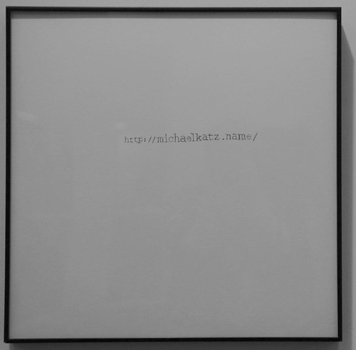
Michael Katz left many wondering more about his web site with his piece in the art exhibition. If you’re curious you can visit his web site www.michaelkatz.name
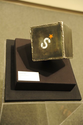
Patrick Luther took a three dimensional approach to the concept of a self portrait.
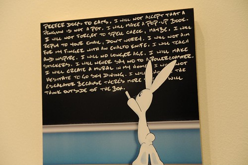
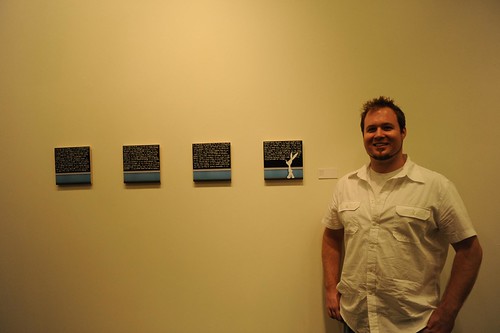
Kenny Roy’s project was definitely another one of my favorites. His well known Rabbit was on display at the gallery writing on a blackboard many great thoughts.
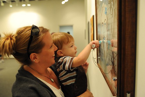
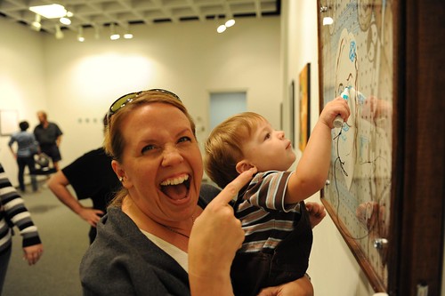
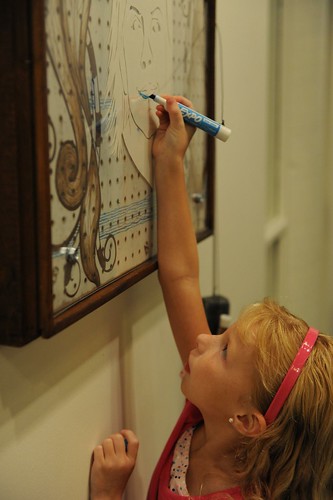
One of the biggest hits of the faculty show was Meg Curtis’ unique illustration that allowed the final piece to be determined by the viewers experience with the piece. The unique illustration was covered by plexiglass and attached to the frame was a dry eraser and markers. I definitely think it was a hit with many, especially my own children.
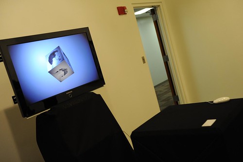
Rob McCaffrey created a fun flash interactive self portrait. It was another great project that people were able to interact with.
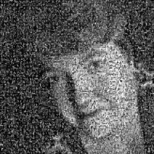
I think I was the only one crazy enough to tackle three projects, and all of which came at the end of the summer semester. But I enjoyed every minute of creating the three that were on display. My mosaic project definitely also raised a lot of questions. It consisted of 1,553 photos I’ve taken over the year as a part of my family 365 photo project where I have been taking a photo every day of everyone in my family. The photos of my family made up a self portrait of me. For those wondering “how” I made the mosaic, all the credit goes to Picture Mosaics. Of course there was a lot more to the process than that which you can read more about my process of this mosaic project on my personal blog.
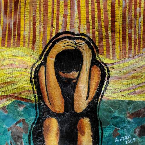
I also created a collage illustration, “Enough II” using pages from an old book that were paper mached, water color along with pen and ink.
If you missed the show it’s not too late to head over the gallery. The exhibit will remain on display through the end of this week, September 18th, 2009. I’ve posted more photos from the exhibit in a set in flickr for those of you interested.
Categories: events


Posted: September 13, 2009 22:50
Thomas Cunningham
Posted: September 14, 2009 09:00
Mandy Bee
Posted: September 14, 2009 11:13
Billy Mitchum
Posted: September 14, 2009 14:34
Justin Cruz
Posted: September 14, 2009 19:05
Xavier Vanegas